Lyrical Corp
Rogue Wave
A full rebrand and website for Rogue Wave — a new identity with the confidence to match the name.
- Logo→siteone system, end to end
- Scalablemark holds from favicon to billboard
- Guidelinesso the brand stays consistent
The brief
Rogue Wave had a strong name and a weak identity around it — a logo that didn't travel, no consistent system, and a site that undersold the work. They wanted a brand that looked as bold as it sounded, and a website to launch it on.
What we did
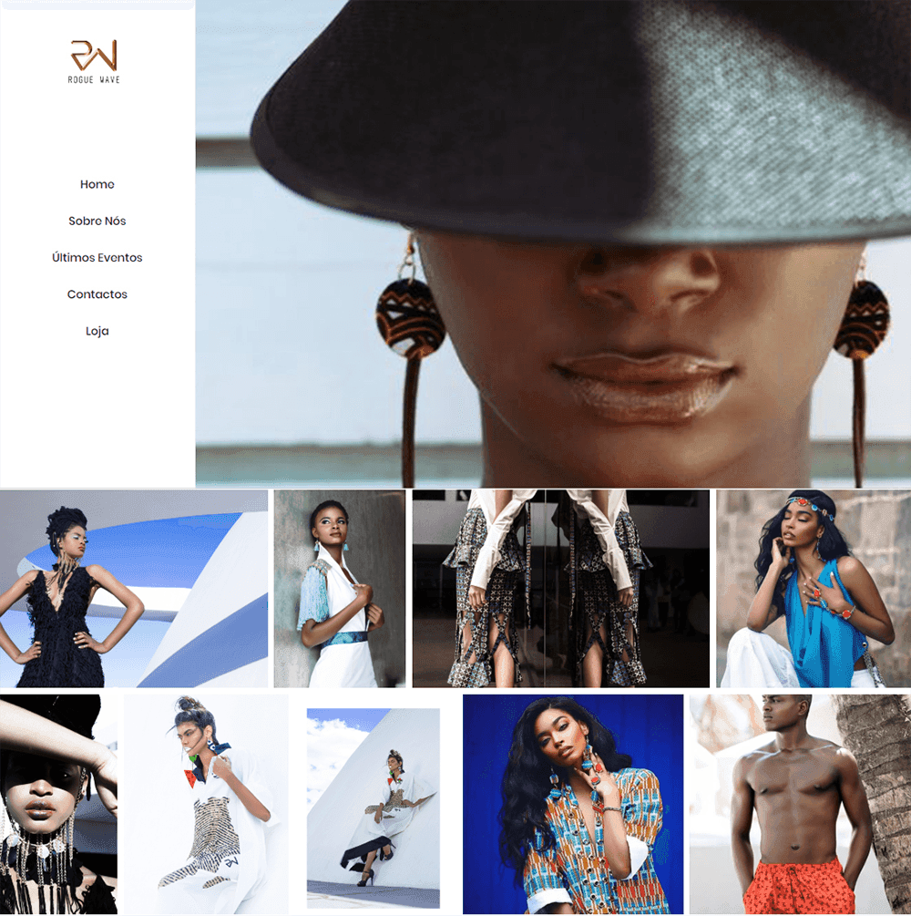
We started with the mark and built outward — a logo that holds up small, a colour and type system with room to breathe, and a website that uses motion and contrast to give the brand momentum.
- +New logo and wordmark, built to scale
- +Colour, type and layout system
- +Brand guidelines for consistent use
- +Responsive website with motion and depth
The outcome
Rogue Wave now reads the way it always wanted to — assured, distinct, and consistent from the logo to the last page of the site.